Grid
Shape
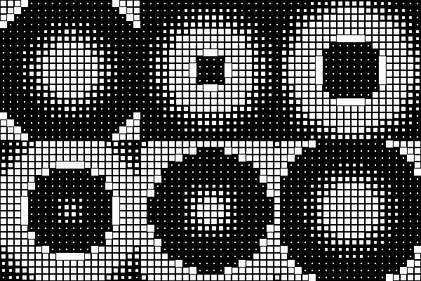
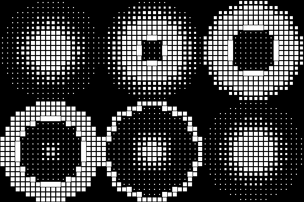
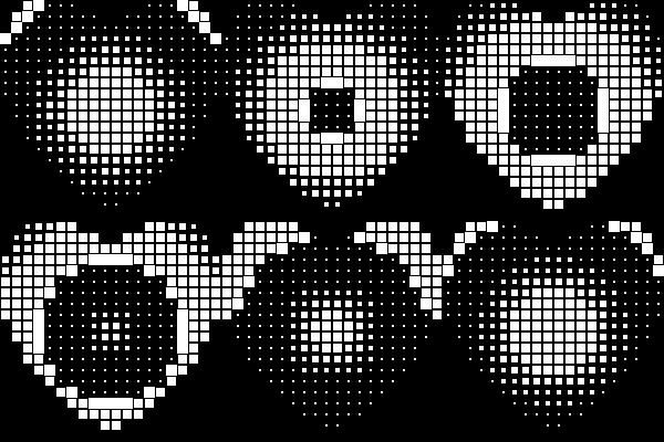
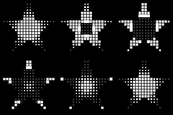
What it does: masks the grid into a shape — only tiles whose center falls inside the shape are drawn; everything outside it shows the background instead. This is completely independent of Sequence and Time shift, which keep animating exactly as set underneath — Shape just decides which tiles are visible.
| Square (default — no mask) | Oval | Heart | Star | Cross |
|---|---|---|---|---|
 |
 |
 |
 |
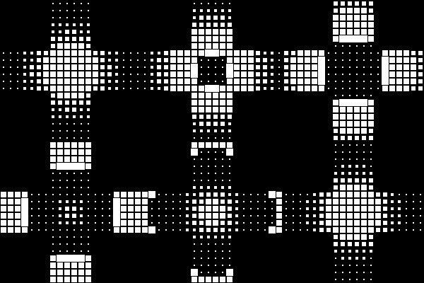 |
"Square" is really "no shape at all" — it's the default because it's the one option that never hides anything. Every other shape (there are around 10, including Rectangle, Diamond, Triangle, Polygon, Flower, and a slot for your own hand-drawn custom shapes) fits itself to the grid the same way, so switching between them at the same grid size just changes which tiles are cut away.
Grid size
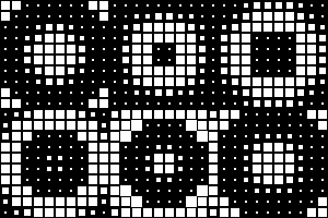
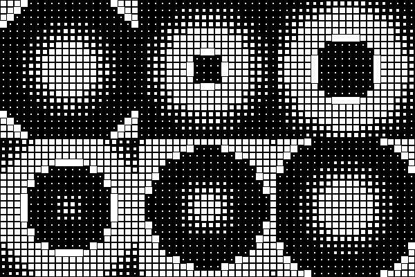
What it does: how many tiles make up the grid, in both directions (kept equal — square — for every Shape except Rectangle, which gets independent width and height instead, since it's the one shape that isn't meant to stay square).
| 10×10 | 20×20 (baseline) | 30×30 |
|---|---|---|
 |
 |
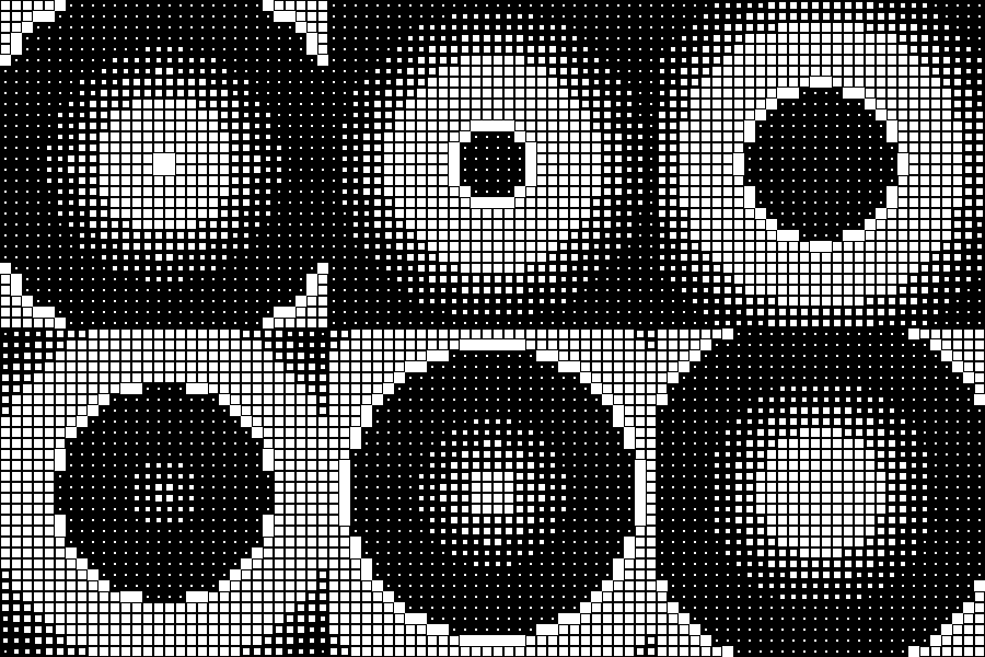 |
A bigger grid doesn't change the tile itself or how fast anything plays — it just means more tiles for Time shift to spread its pattern across, which is why the ripple above looks like it's made of finer detail as the grid grows: the same 0–100% Stagger spread now has more individual steps to divide itself across.
A shape's own settings
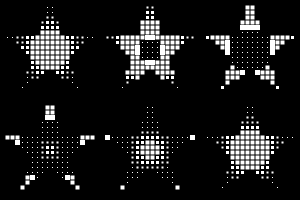
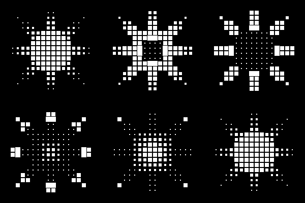
Several shapes have their own extra controls once selected — Star is a good example, with a point count and a thickness (how deep the notches between points cut in):
| Star, 5 points | Star, 8 points |
|---|---|
 |
 |
Others follow the same pattern — Rectangle has corner rounding, Heart has a sharpness slider (round and soft vs. sharply pointed), Flower has petal count and thickness, and so on. These are best explored directly in the Shape picker, where every option previews live at its current settings.